Intro
Intro
Redesign the LikeMeat corporate site to make plant-based look drool-worthy.
Client
LiveKindly Collective
Services
UI Design / Product Design / Web Design Lead
Platform
Web
Year
2022
Case Study — LiveKindly Collective
Redesign of the LikeMeat corporate site for the LiveKindly Collective — food-first visuals, a dual journey for new vs familiar users, and craving sliders that make plant-based look drool-worthy.
Client
LiveKindly Collective
Role
UI / Product / Web Design Lead
Year
2022
Platform
Web Design
Intro
Intro
Client
LiveKindly Collective
Services
UI Design / Product Design / Web Design Lead
Platform
Web
Year
2022
01 — About the Project
01 — About the Project
Translate the quirky LikeMeat brand onto their primary digital presence by building a new site with a focus on interactivity and food visuals. LikeMeat is all about appetising plant-based food, so the site heroes food imagery.
Unlike some brands in the LiveKindly collective, vegan activism is not the primary drive. LikeMeat is a brand for meat-eaters and a younger audience — it concentrates on making the food look tasty rather than pushing vegan benefits. The website needed a clear journey for people new to plant-based, as well as users already at home with the diet.
4
Product goals on the site
2
Custom user journeys
6
Markets after the global build
3
Craving sliders for recipes
01 — Goals
01 — Goals
Food
Show off the plant-based products with jaw-dropping visuals that invite users to stay.
Recipes
Feature the best LikeMeat recipes in one place — catalogued in a cohesive, interesting way. Recipes are a main lead to the site.
Interaction
Create a customised journey based on how familiar users already are with vegan foods.
Products
Once users buy into a recipe, present the accompanying products and purchasing information across 6 markets.
02 — Design Language
02 — Design Language
The visual system is built around LikeMeat’s high-contrast palette — primary yellow (#FFDE00) with pink and teal secondaries — plus Arpad and Apercu for display and UI type. Iconography stays chunky and playful so the digital experience matches the packaging.
03 — Wireframes
03 — Wireframes
Once the goals and information architecture were laid out, the team built the wireframes and collaborated on the final layouts before moving into visual design.
04 — Hero Banner Process
04 — Hero Banner Process
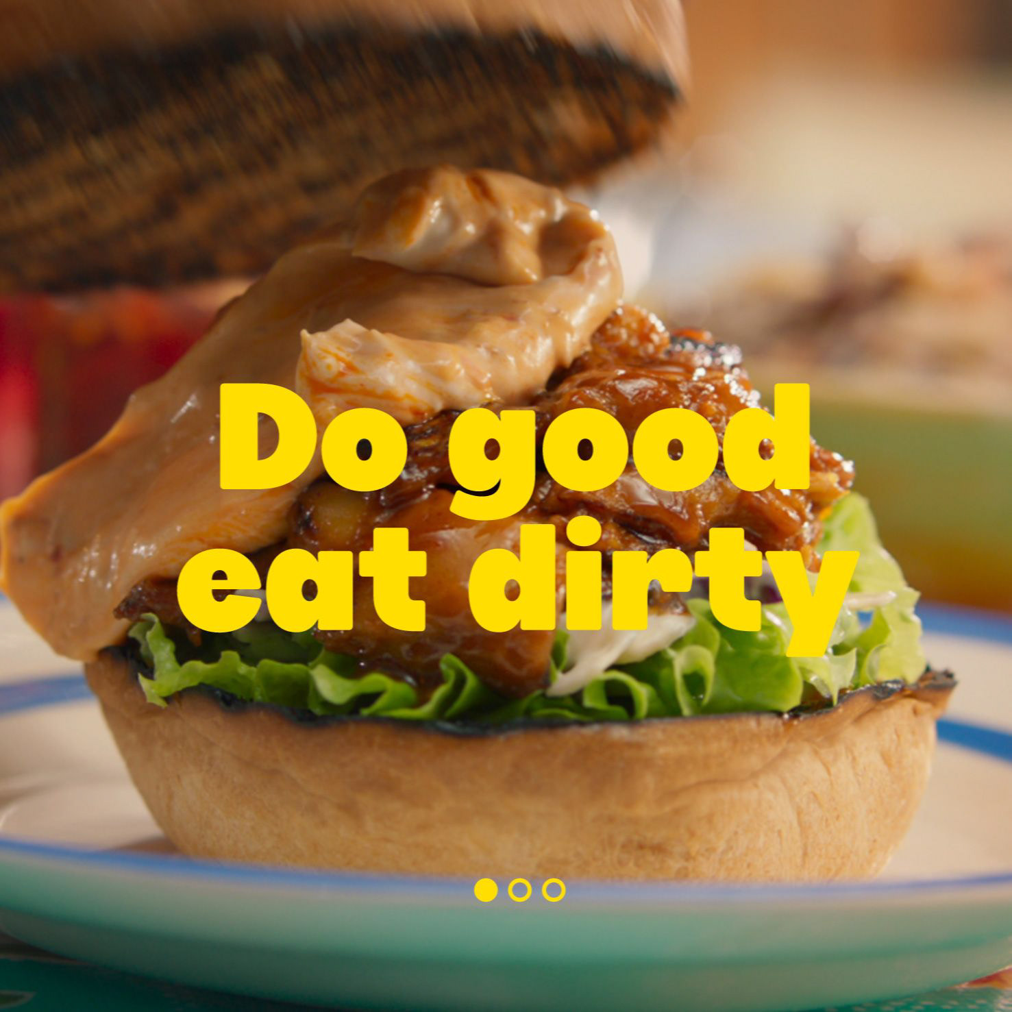
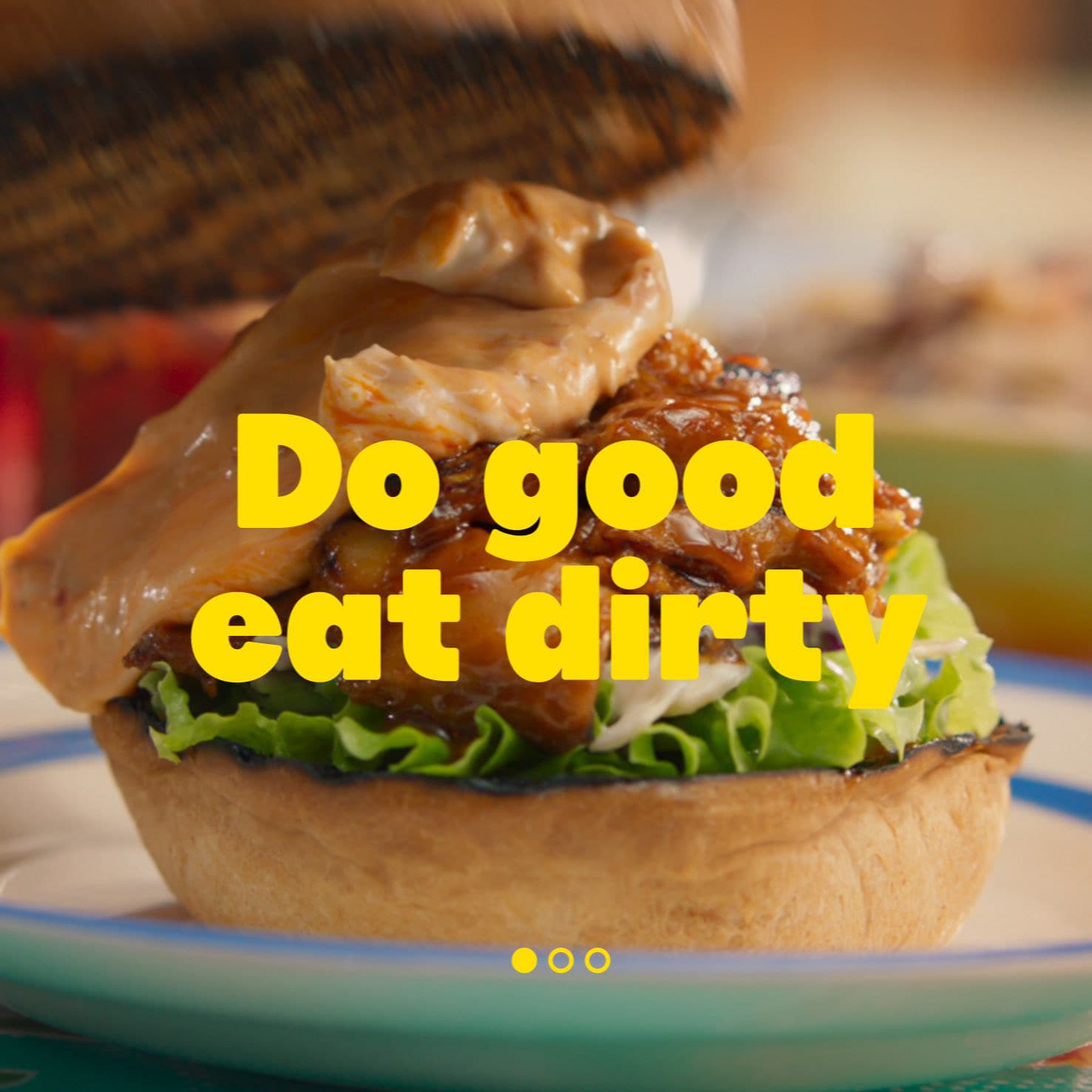
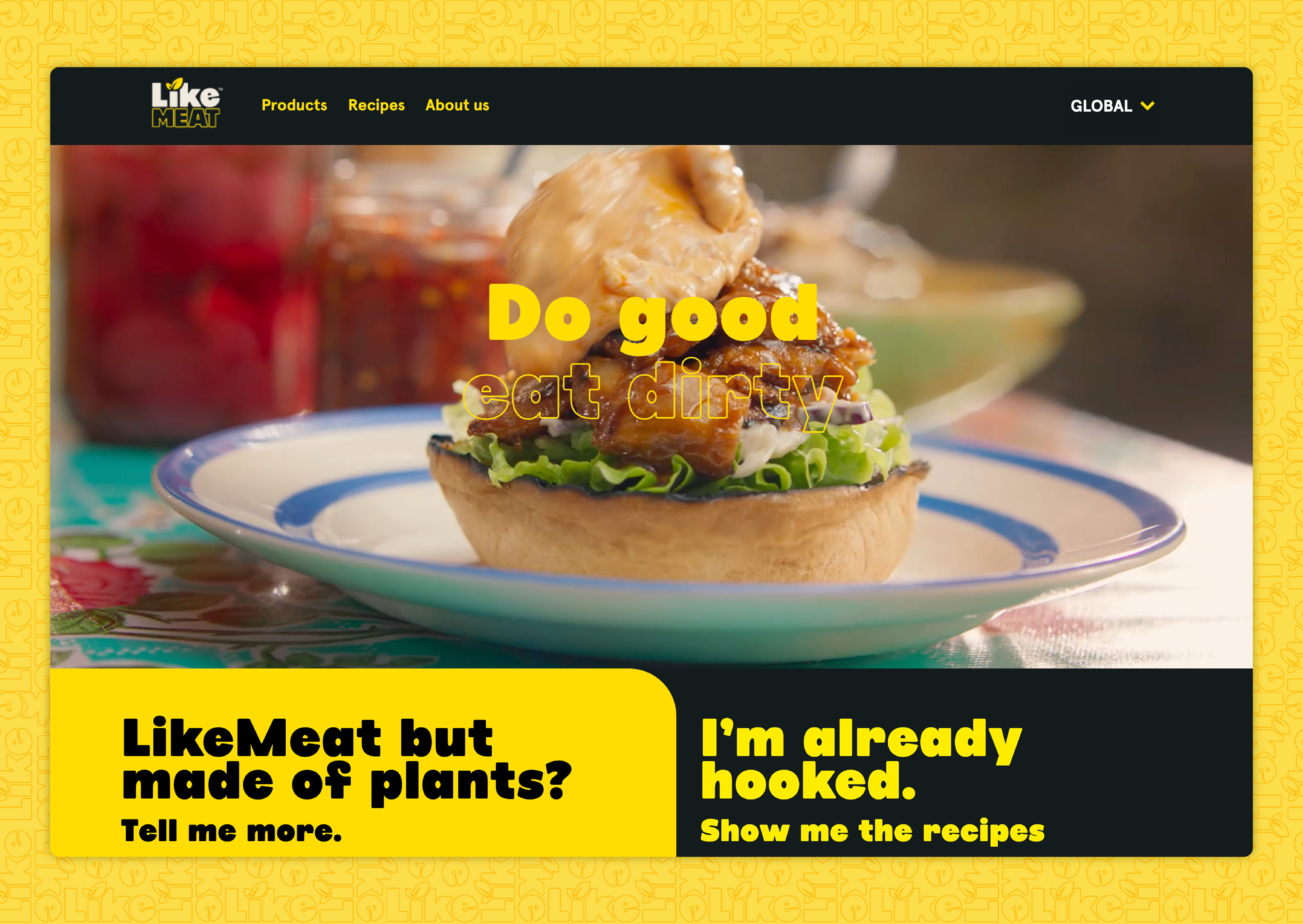
We went through several iterations for the home page hero banner. Each round consisted of design, review, feedback, and redesign. The client team and internal technical teams were part of those sessions. We landed on the simplified video banner as the best user onboarding solution.
05 — Product Walkthrough
05 — Product Walkthrough
A sauce-dripping video kicks off your salivary glands at first glance. From there the user is presented with two separate journeys. The default path is for people new to plant-based food — more information about the products and how the food is made. The second is for people already familiar with plant-based eating, and takes them straight to recipes.
Entry paths
New to plant-based
Default journey — product stories, how the food is made, and room to get comfortable before recipes.
Already familiar
Skip persuasion and go straight to the recipe section to browse the selection.

06 — Recipe Slider
06 — Recipe Slider
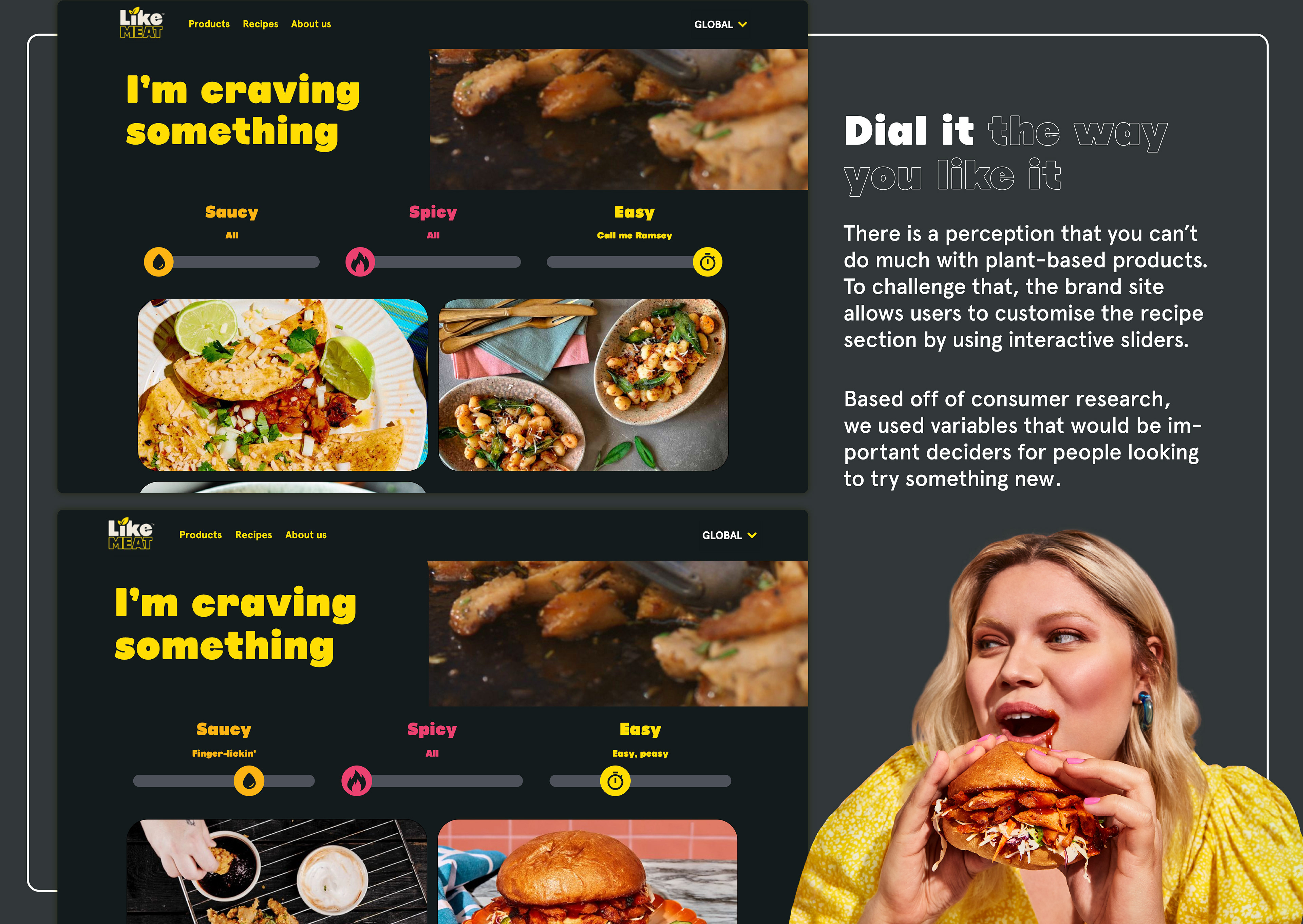
Nifty sliders serve recipes that tickle those tastebuds just right. Users pull three sliders — Saucy, Spicy, and Easy — to populate relevant recipes, with playful labels like “Finger lickin’” and “Call me Ramsey”.
07 — Product Pages
07 — Product Pages
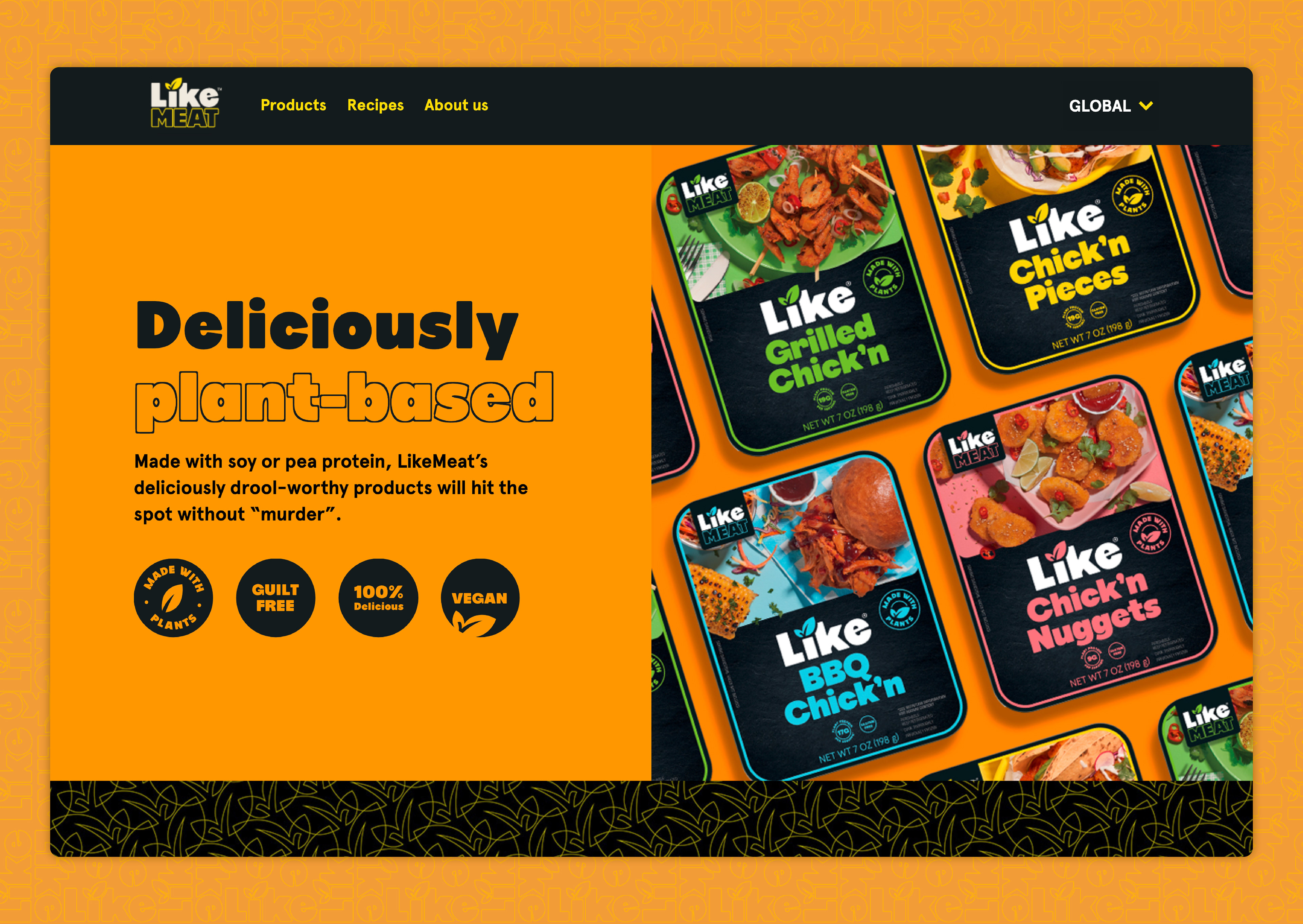
LikeMeat’s wide range of products was presented with the same colourful theme as the brand, plus a neat filter to sort them according to food type.
08 — Six Markets
08 — Six Markets
Once the global page was built it had to be duplicated and adjusted for the six markets LikeMeat sells in — including the US, Germany, Netherlands, Nordics, and Finland. Location is detected automatically, then the appropriate page and language is presented.
09 — Responsive Design
09 — Responsive Design
We followed mobile design best practice and made sure the site worked across devices and browsers. Special attention went to bringing the brand tone of voice through design and pointed micro-interactions.
10 — Results
10 — Results
We challenged the conventions of what plant-based looks like with a custom-built site and a personalised user journey based on the route you choose at the start. Craving sliders served up recipes according to what you are starving for, and delicious food imagery was the hero on every page.
The LiveKindly Collective was ecstatic with the results and commissioned us to build another three of their sites.
Client
LiveKindly Collective
Year
2022
Role
UI Design / Product Design / Web Design Lead
Credits
Angela Gough — Copywriter, Creative Director
Senzo Xulu — Creative Director
Demi Maasburg — Web Design Rollout
Outcome
A custom site that challenged what plant-based looks like online. LiveKindly was ecstatic and commissioned another three of their sites.
View full case study on Behance