Website redesign
2024
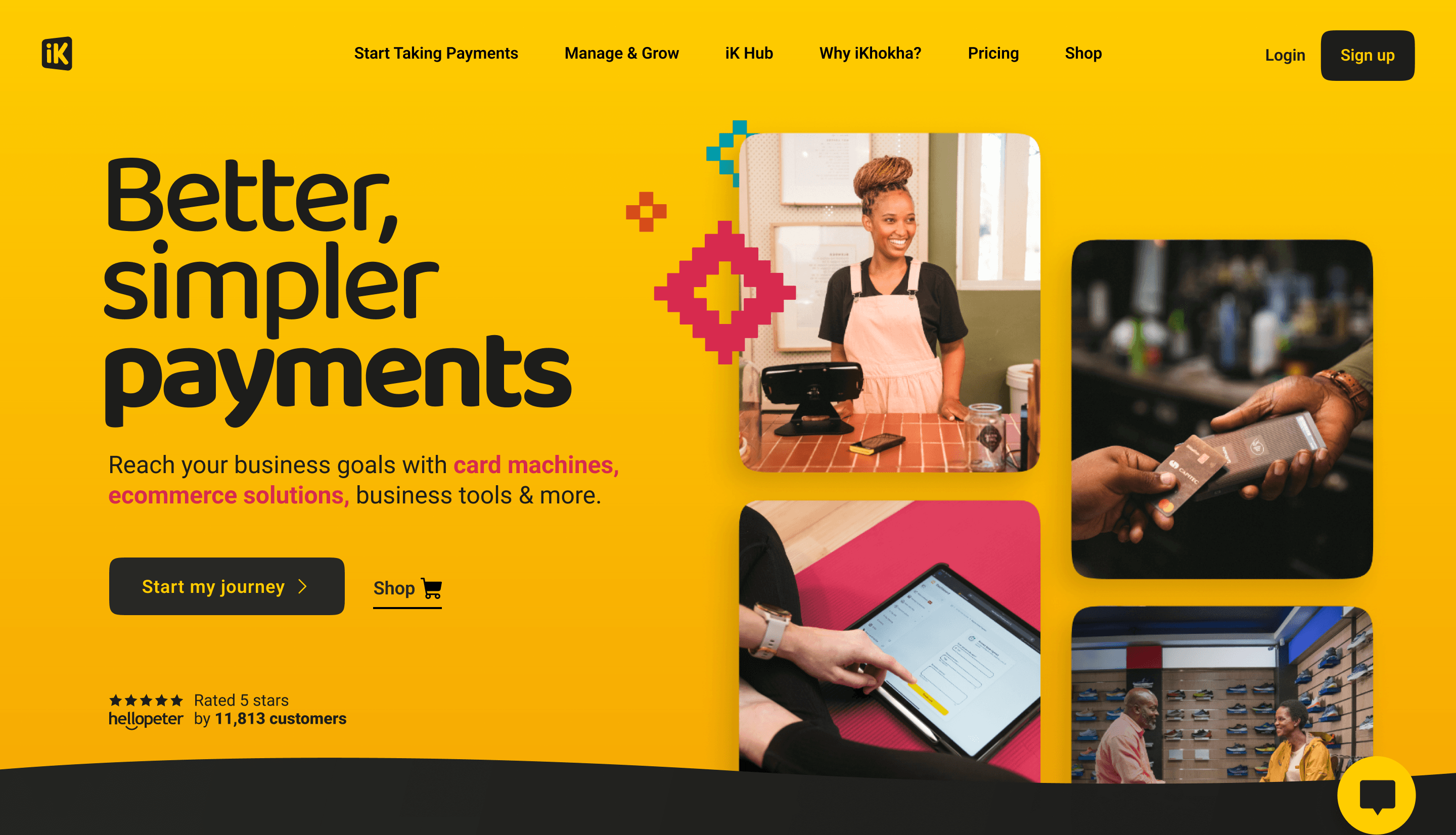
A full website redesign for one of South Africa's leading payment providers — repositioning iKhokha as a modern fintech brand while making products easier to discover and understand.
Background
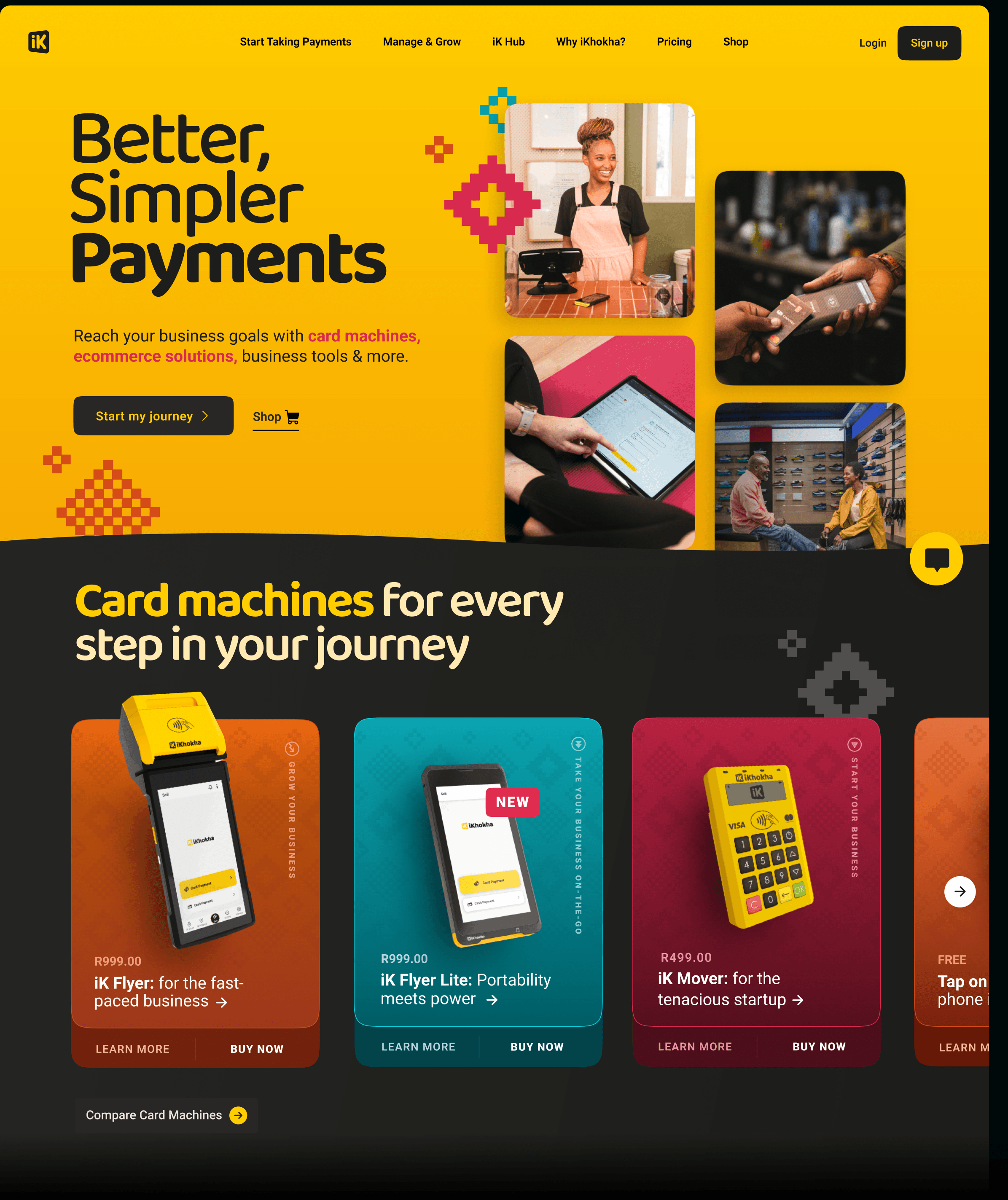
A complete tech stack overhaul with a visual redesign was required. That meant a new look and UI style guide, plus a site that could showcase the new wave of digital payment solutions while still presenting the bread-and-butter card machine products in a refreshing way.
The previous site struggled to communicate a growing product suite. Merchants arrived with different intents — some wanted card machines, others e-commerce tools — but the information architecture did not guide them quickly enough.
My role
I led product and web design on the redesign — developing the bold visual language, structuring navigation around merchant jobs-to-be-done, designing modular page templates, and running moderated usability sessions with ten merchants.
I collaborated with a product design manager, service designer, engineers, SEO, and product managers through Sanity CMS delivery and launch.
Opportunity — bold & confident
The challenge was to revamp the iKhokha website so it felt more interactive, engaging and dynamic — while still delivering a great user experience for merchants on the go.
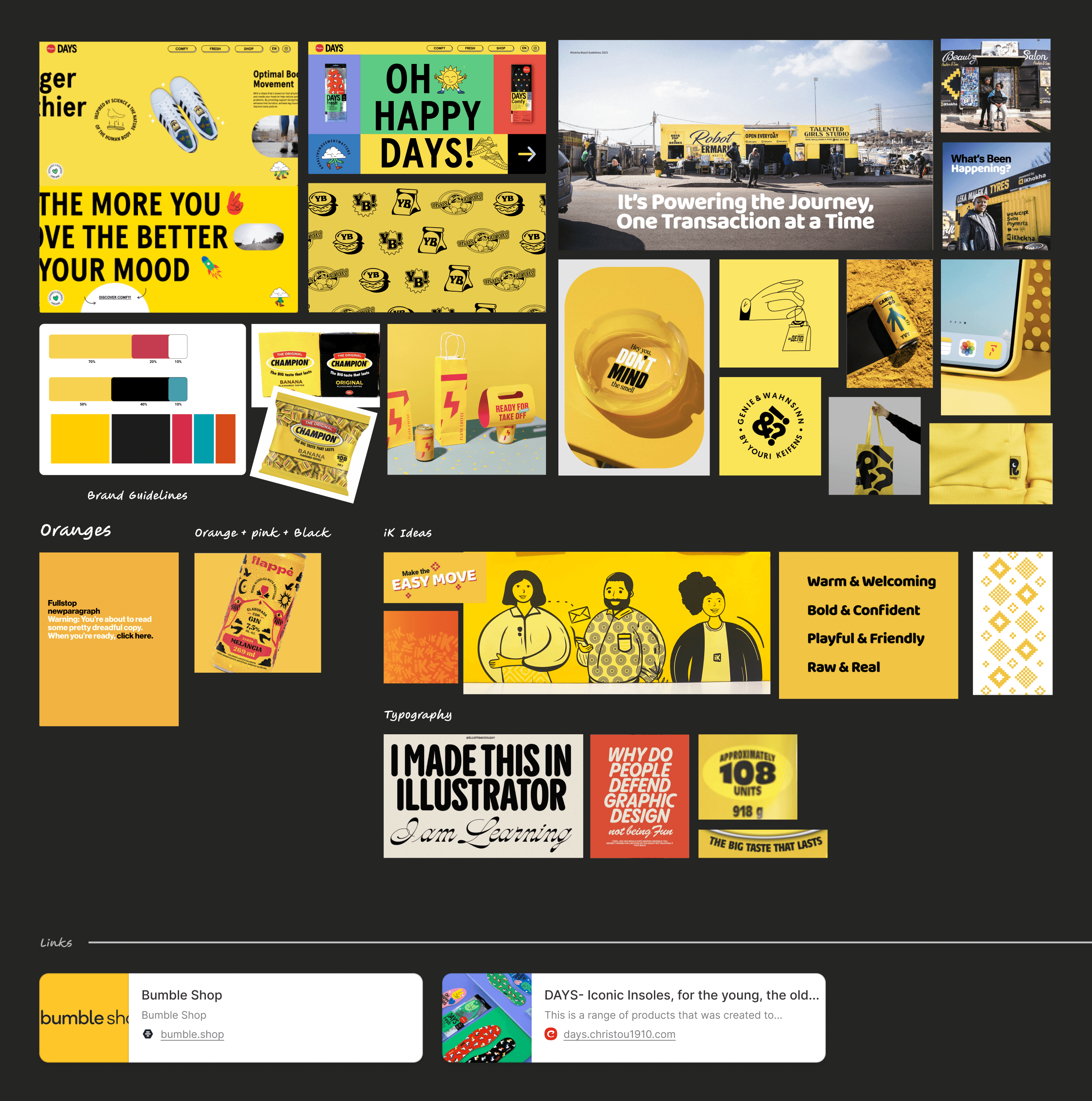
We took inspiration from our merchants' bold & confident signage. We wanted the vibrancy of real-world businesses, and to distinguish ourselves from the pastel, muted tone many competitors were pursuing.
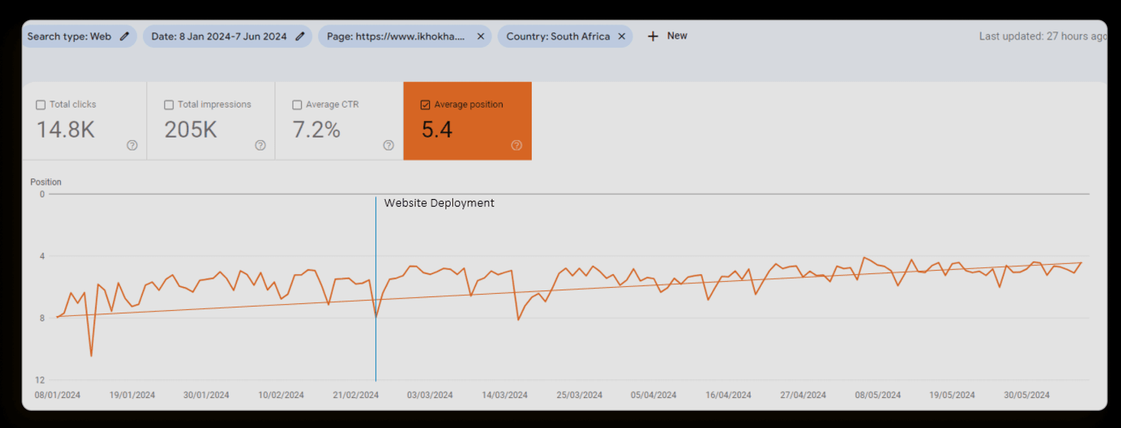
- 8 → 5
- Google search position for the homepage
- +38%
- higher organic search ranking after launch
- 78.6
- SUS usability score, rated “Good”
Moodboard — print-era energy, modern product
We wanted this quintessential iKhokha look to come through backgrounds, images, icons and UI elements — giving homage to print-era aesthetics with a timeless feel. That aligned with brand purpose, visual identity and colour ratio.
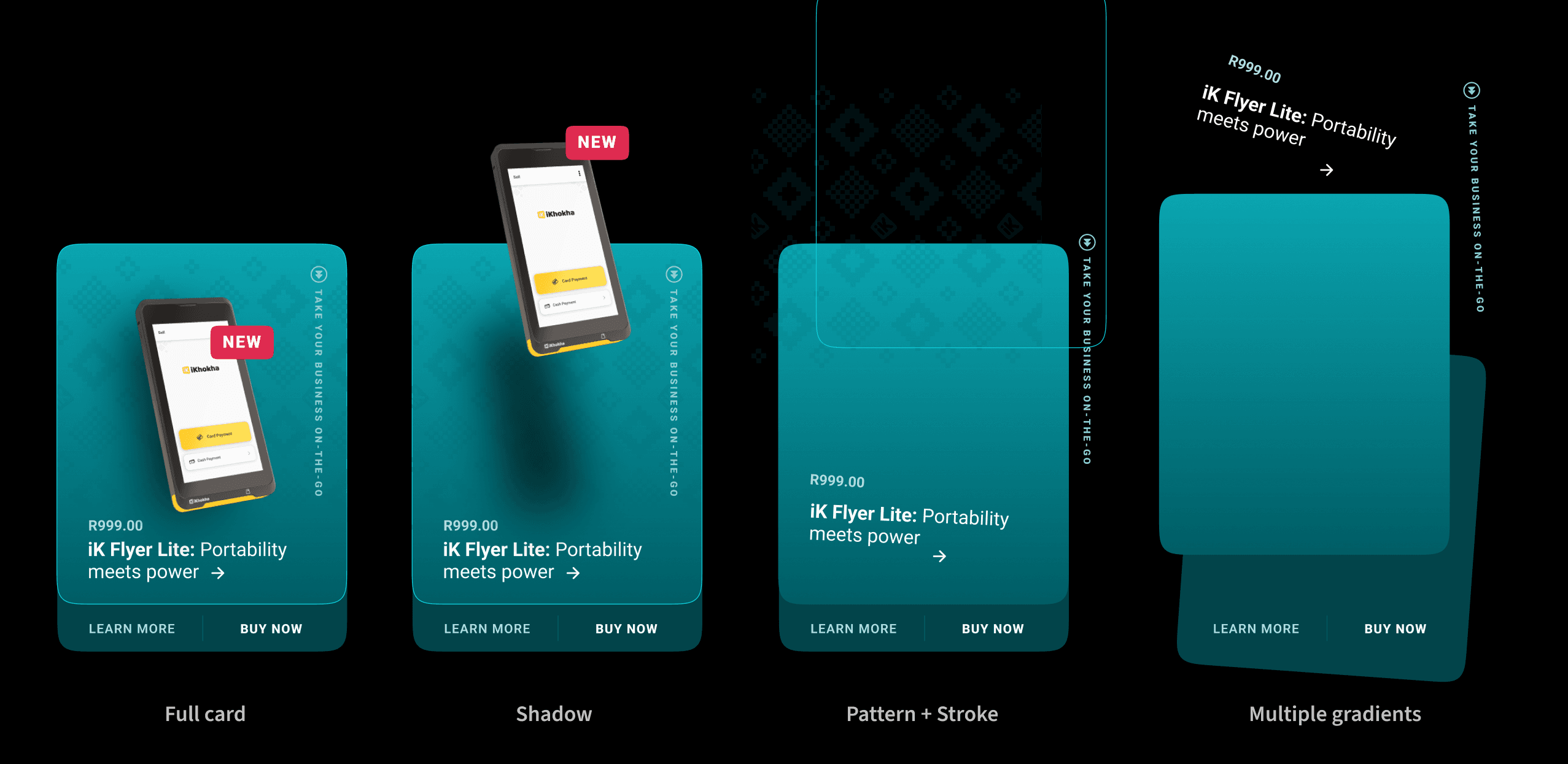
Card deconstruction
Brand new cards were designed for the primary card machine product carousel. They combine gradients, patterns and strokes into an interactive card that exhibits device features without feeling like a generic product tile.
Testing with real merchants
A quantitative study of ten moderated users was run via Teams. Participants included iKhokha merchants and non-customers, sharing their screens while navigating the new website.
The majority found the new site easy to navigate. Seven of ten responses rated the experience positive, and the SUS score landed at 78.6 — rated Good.
“Most of the participants expressed that they found the website easy to navigate and felt confident in interacting with its features and functions.”
Outcome
The homepage ranking moved from position 8 to position 5 after deployment. The SEO manager noted that efficient design and page speed contributed to the lift — evidence the site was meeting Google's effective design criteria.
Higher organic search ranking
Homepage climbed from Google position 8 to 5 after the redesign launched.
Delivery
The tech stack overhaul and visual redesign proved a resounding success — reflecting the brand's bold identity while setting a clearer standard in South African fintech. Modular templates meant marketing could ship new landing pages without breaking consistency.
The new design, inspired by vibrant real-world merchants, resonated with users and helped differentiate iKhokha from competitors pursuing muted pastels.
Jobs-to-be-done nav
Restructured navigation around merchant intent rather than internal product names.
Modular templates
Page patterns marketing can reuse without breaking the visual system.
Mobile-first
Performance and layout prioritised for owners browsing on the go.