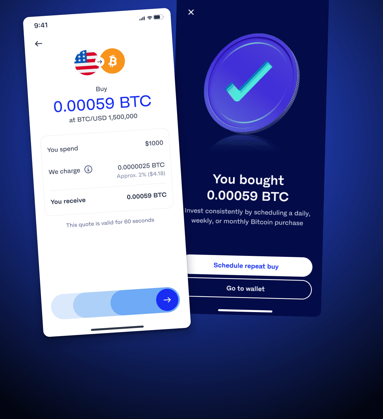
Luno buy journey
2024 — 2026
Rebuilt the primary crypto buy flow for Luno — cutting nine steps to five, shipping across three markets and three platforms, and lifting conversion by 12% in an A/B test.
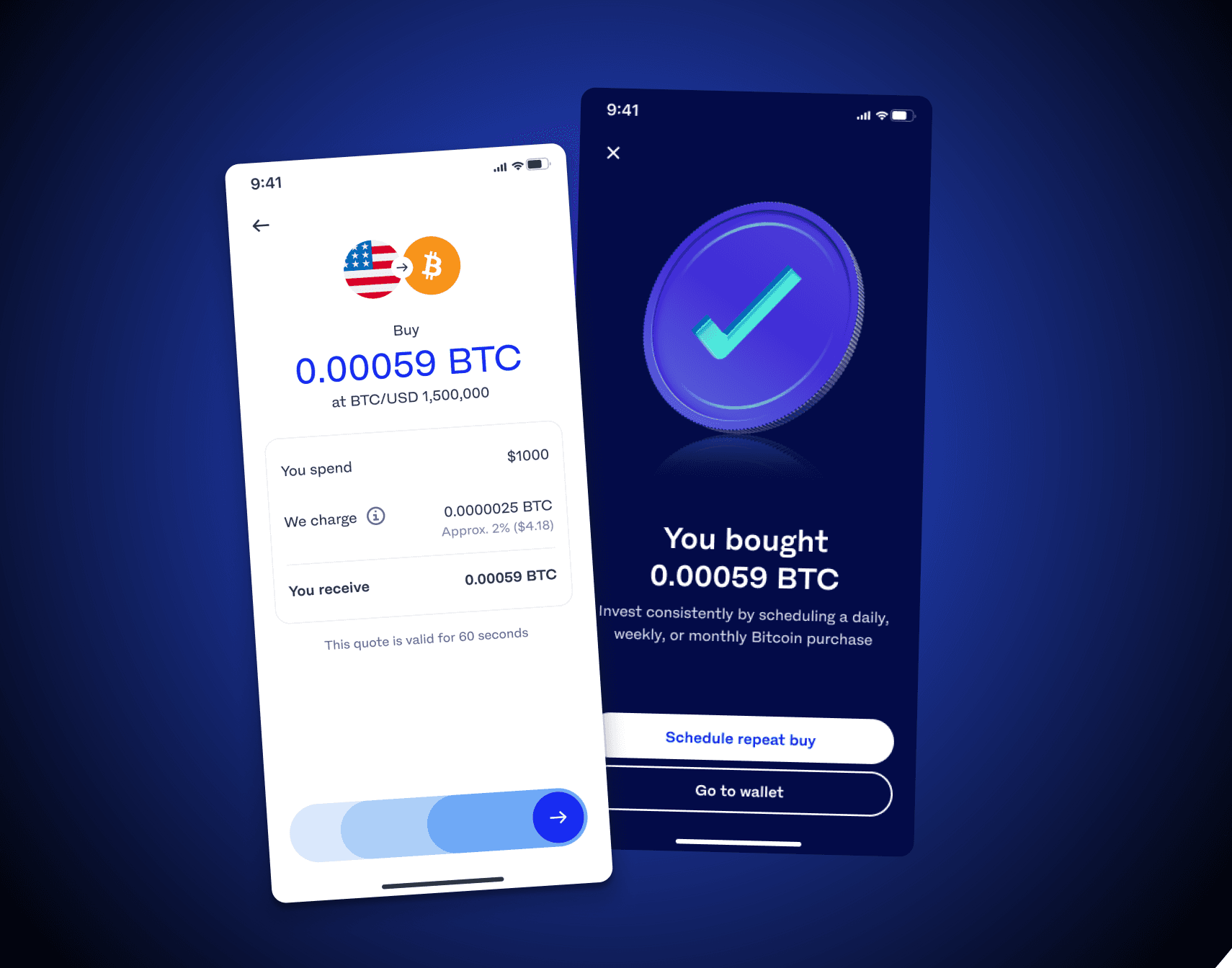
Background
Luno's primary buy flow had been carrying design debt for a while. The old journey was still live, an earlier redesign had stalled somewhere between design and delivery, and the team needed a pragmatic way back to shipping.
So the brief had two halves. The design problem was to streamline the transactional journey, remove friction and support ARPU growth. The business problem was to rebuild momentum — to get a high-quality implementation actually built, in a way the team could sustain across web, iOS and Android in Malaysia, Nigeria and South Africa.
My role
I led product design on the buy journey. That meant framing the opportunity from Amplitude data and competitor research, running an impact/effort workshop with the PM and engineering manager, facilitating a wireframe workshop with the engineers who would build it, and owning the amount input screen through UI exploration, moderated testing and a phased regional rollout.
I worked alongside a product manager, a data scientist, a design system lead, a UX writer and engineers across three platforms — and stayed with the work through QA on staging.
Opportunity — no single leak, but plenty of drag
The funnel data did not hand us one catastrophic drop-off. What it showed instead was drag: steps that asked users to decide things they had already decided. A competitor review across South African and global exchanges confirmed the hypotheses we had formed — remove redundant steps, pre-select sensible defaults, and stop asking for a PIN on a low-risk action.
With the EM and PM I ran a structured impact/effort workshop to choose an approach. We picked a new codebase on the new design system: the highest effort option on the board, and the only one with real long-term upside.
- 14%
- of users ever chose repeat buy on its own screen
- 9
- steps before a purchase could be confirmed
- 3
- redundant decisions we could remove with evidence
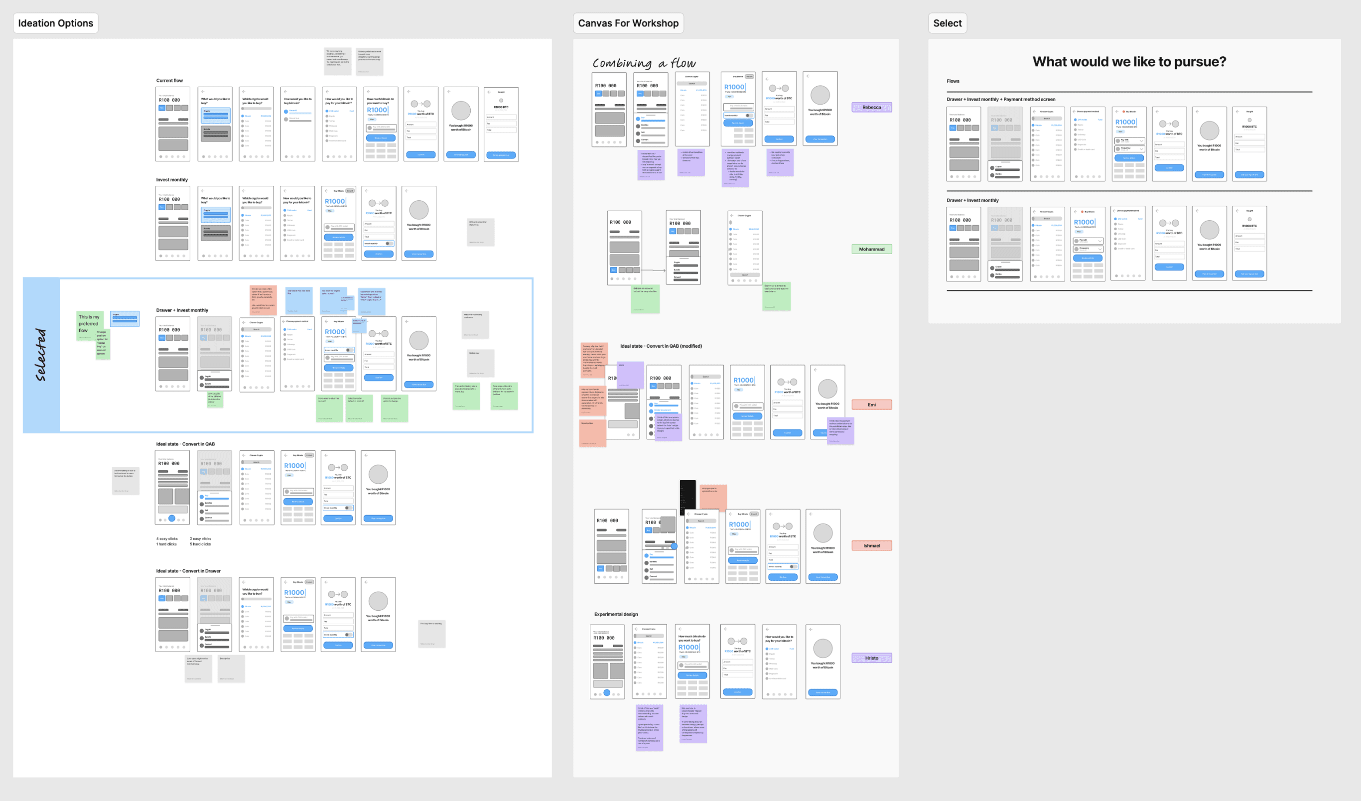
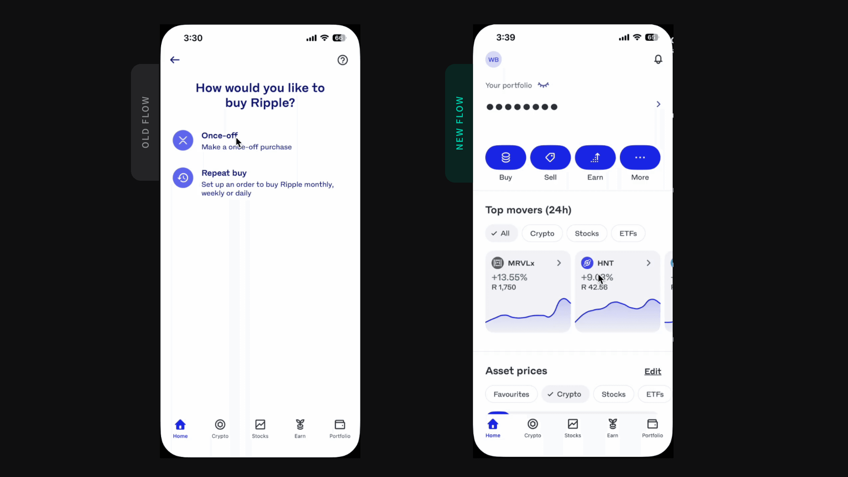
From nine steps to five
The existing flow asked for three decisions most people had already made: payment method, frequency, and a PIN. Each removal was argued from data rather than a preference for fewer screens.
Payment pre-selected
Defaults to the last method used, so an entire screen disappears for the majority of buyers.
Once-off as the default
Fewer than 14% ever chose repeat buy on the dedicated screen. It now lives in a dropdown.
PIN removed
Buying is not sending or withdrawing. Authentication at login made the extra step redundant.
Design iterations
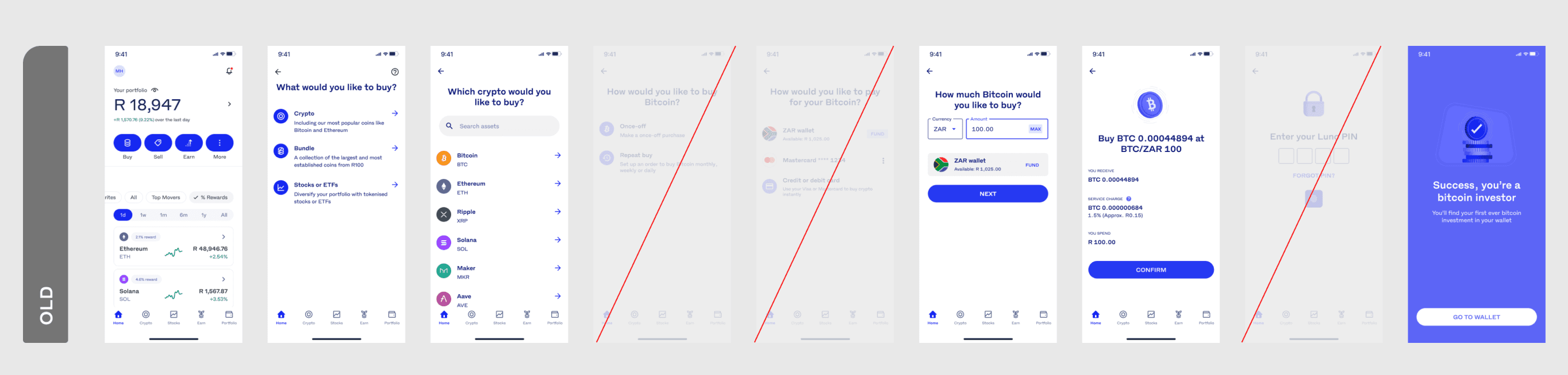
Engineering came in early. Every person in the wireframe workshop proposed their own version of the flow, which surfaced real build constraints before any high-fidelity work started and gave the team shared ownership of the result.
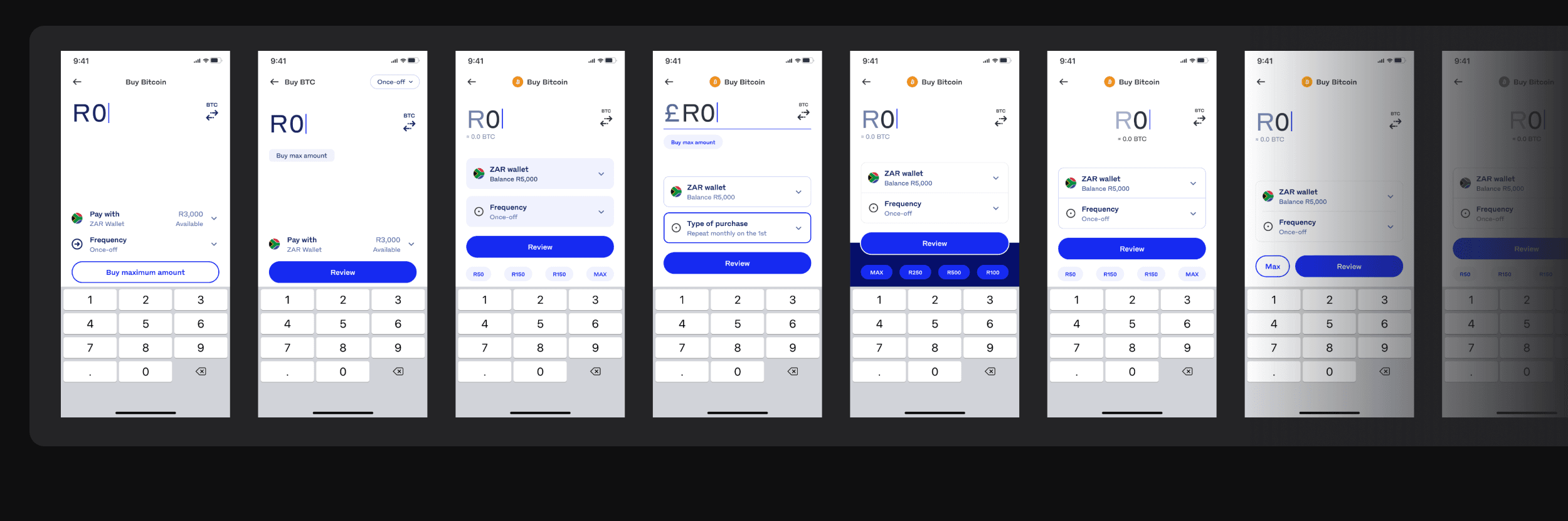
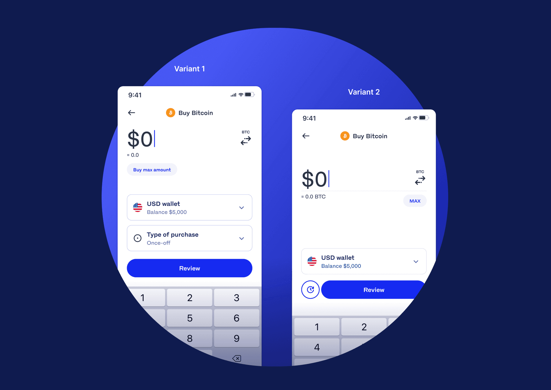
Most screens already existed. The hard one was amount input, which had to hold the amount, the estimated crypto, a swap control, buy max, the payment selector and the frequency selector without feeling crowded. I worked on it with our design system lead and we took two variants forward.
Testing with real customers
We ran a moderated study with eight Luno customers in South Africa and Malaysia, all active buyers within the last 30 days. Each session opened with a benchmark task on the current flow so we had a baseline usability score to compare against.
Variant 1 won on discoverability and preference. Participants completed once-off and repeat purchases, used Max, toggled between fiat and crypto input, and changed payment method without prompting. Half of them called out swipe-to-buy unprompted.
“That's a lot of steps in between — we could summarise it into a page where you have dropdown buttons where you can choose and select your options, your payments.”
Outcome
The A/B test ran from 28 January to 27 February against the live journey. The hypothesis was that a simpler interface with clearer visual hierarchy would reduce friction and deliver at least a 2% uplift from amount input to completed purchase. It delivered six times that.
Conversion lift, A/B tested
Amount input → completed purchase, 28 Jan – 27 Feb. The target was +2%.
Delivery
Final files were structured in phased sections per region, each covering web, iOS and Android. An acceptance criteria document let engineers work through the build linearly, with full flows, error states, expected behaviour and animations documented before kick-off.
Malaysia
Primary flow without the payment selector — the smallest safe surface to release on.
Nigeria
Payment select and swaps layered on once the core journey proved stable.
South Africa
Credit card support and refinements from the first two markets.