Purchase journey
2023
User-led purchase journey work for iKhokha — research, guerrilla testing, and an A/B-validated single-step checkout that doubled conversion and cut time-to-convert.
Background
Starting with pain points identified by our service design team, we settled on competitor analysis and desktop research to come up with solutions for these user frustrations. After a few wireframe iterations with team feedback applied, we prototyped the top two options and ran a brief guerrilla test to shortlist them.
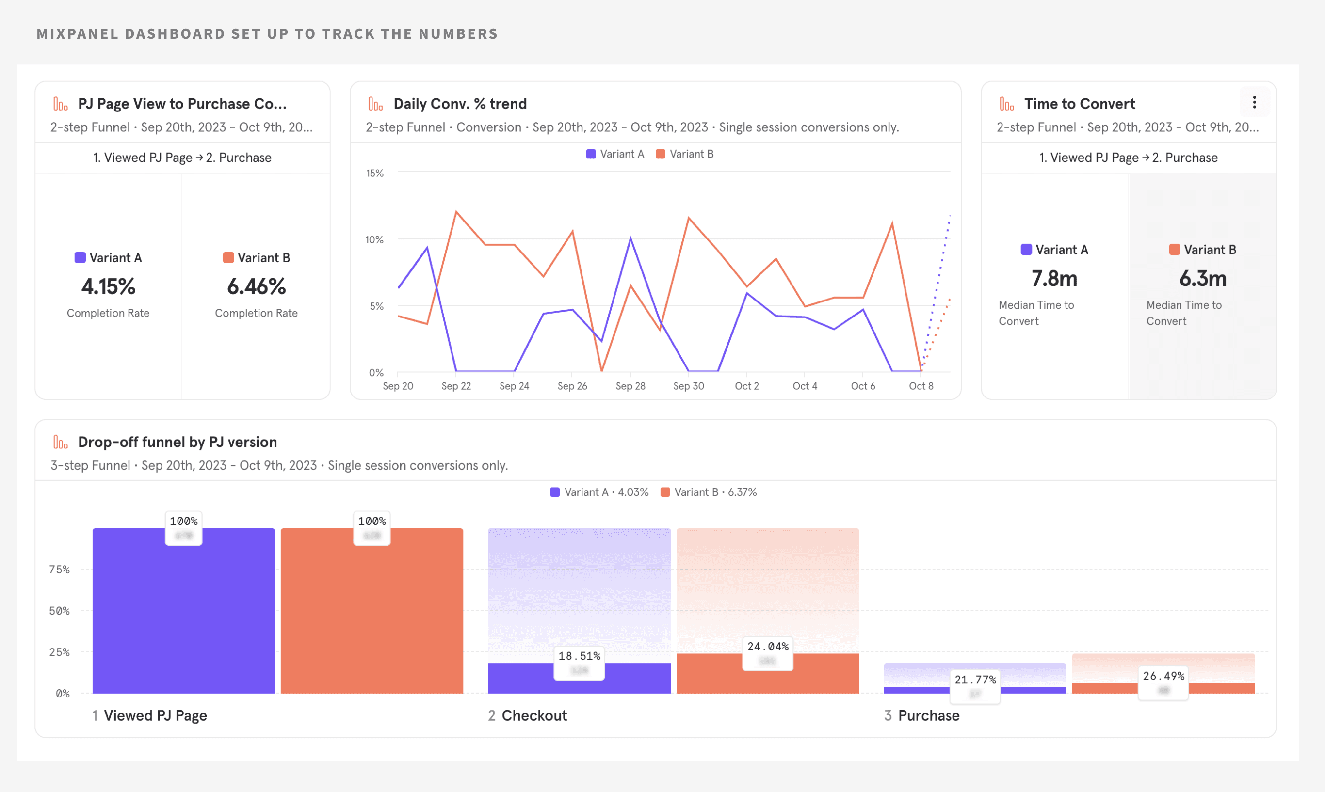
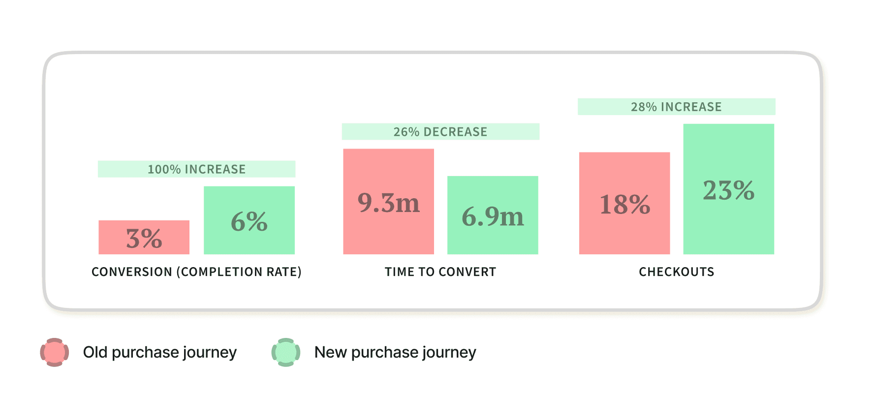
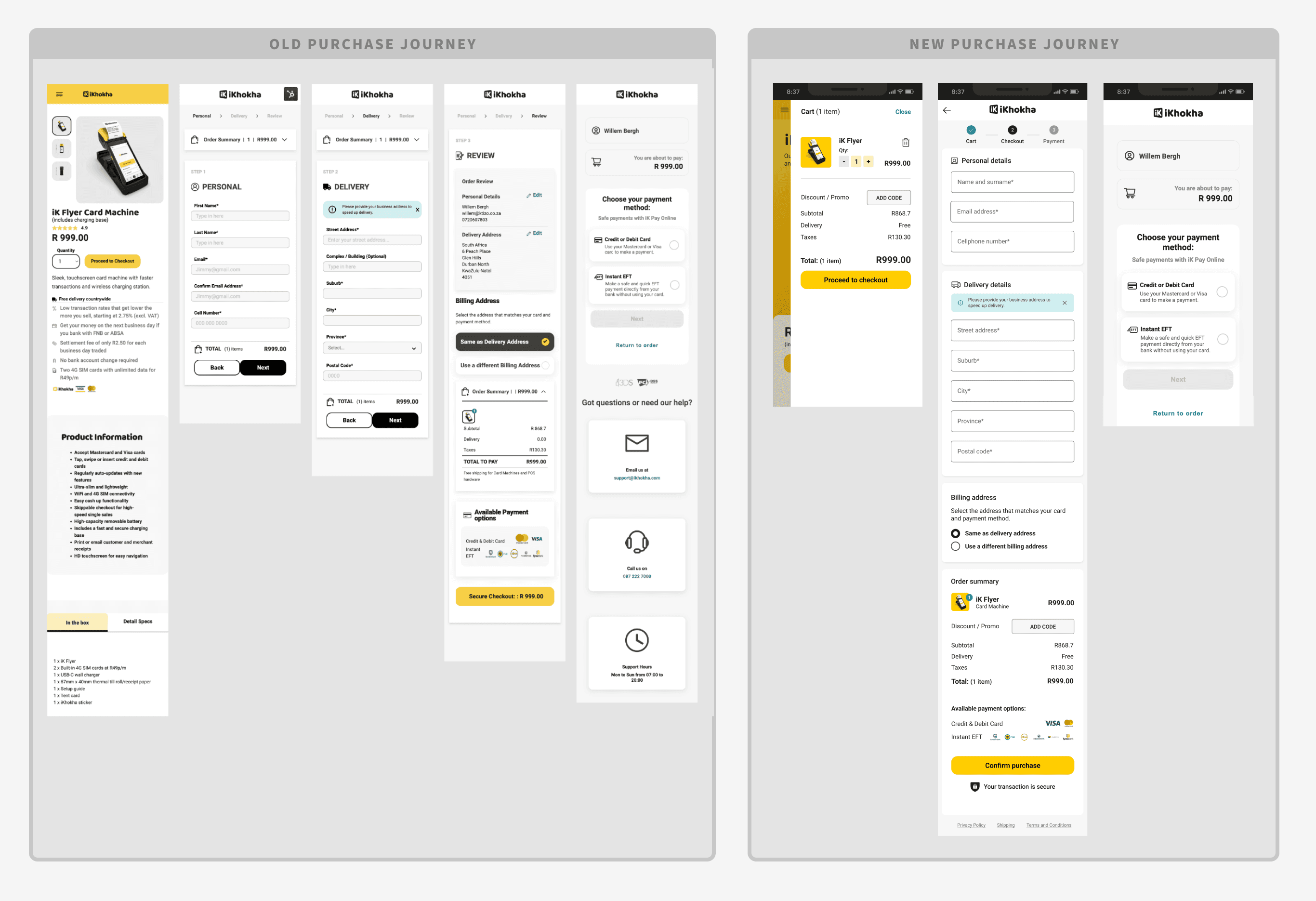
Final adjustments were made and an A/B test ran between the current production journey and our shortlisted design. With an improved conversion rate of 6% from 3% and reduced checkout time of 6.9 minutes from 9.3, the new purchase journey was implemented once it reached statistical significance.
My role
I owned the UX and UI for the purchase journey — framing the challenge from the service design interview report, running competitor and desktop research, facilitating wireframe workshops, prototyping both single-step and multi-step options, and designing the guerrilla test that shortlisted the winner.
I worked with a product manager, service designer, engineers and a technical architect through HubSpot A/B setup and Mixpanel instrumentation until the new journey permanently replaced production.
Opportunity — how might we improve the purchase journey?
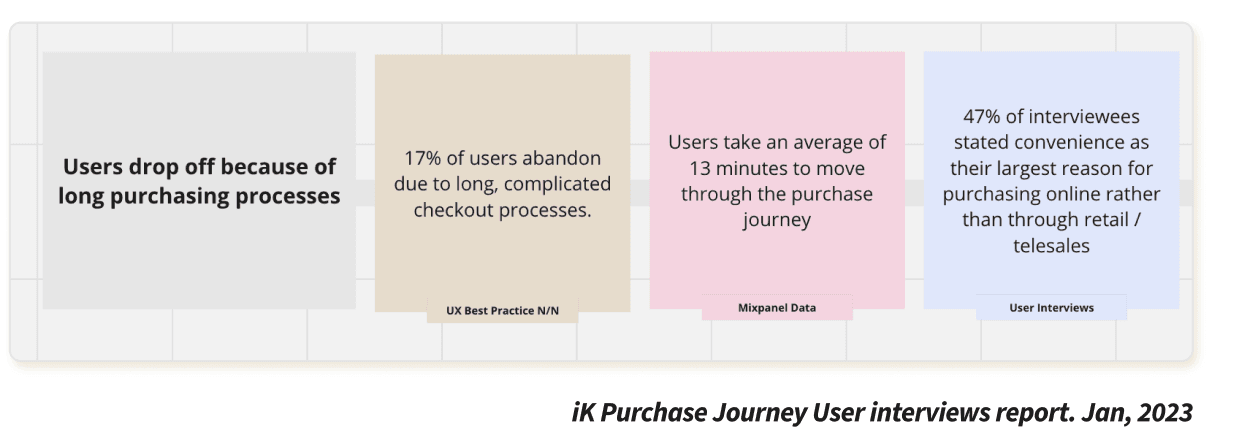
Service design interviews surfaced three primary drop-off drivers. Merchants were abandoning before pay — not because of price alone, but because the journey asked too much, too late, with too little reassurance.
- 3%
- baseline completion rate on the old journey
- 9.3m
- average time to convert before the redesign
- 3
- pain points that shaped every design decision
Long purchase journey
As a user, I want a streamlined checkout that is faster and has fewer friction points.
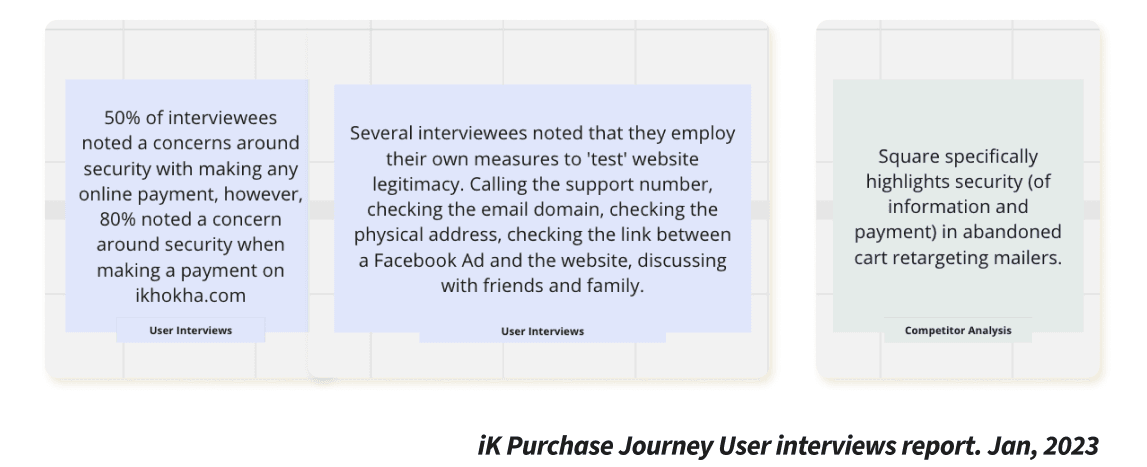
Trust issues
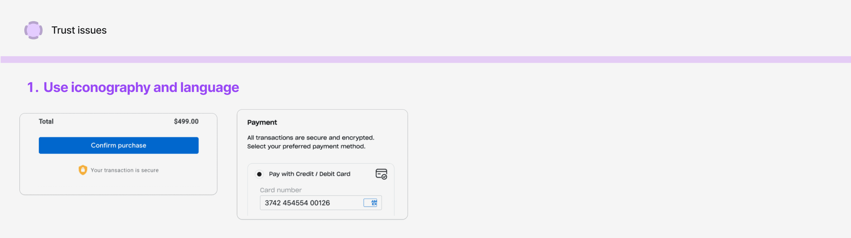
Users have trust concerns when purchasing online, especially with lesser-known brands like iKhokha.
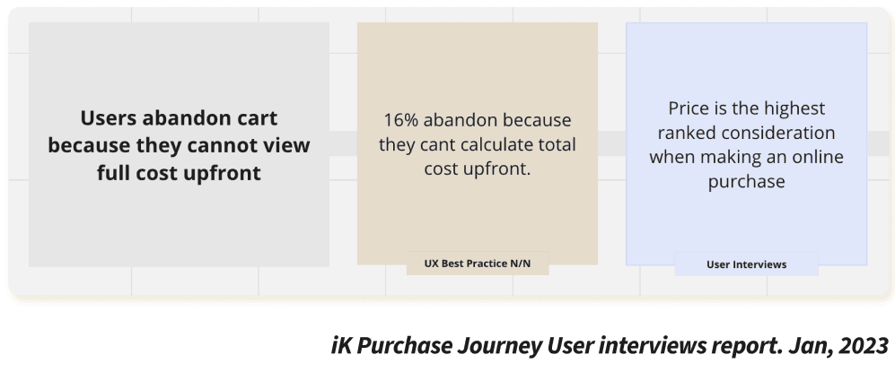
Full cost up front
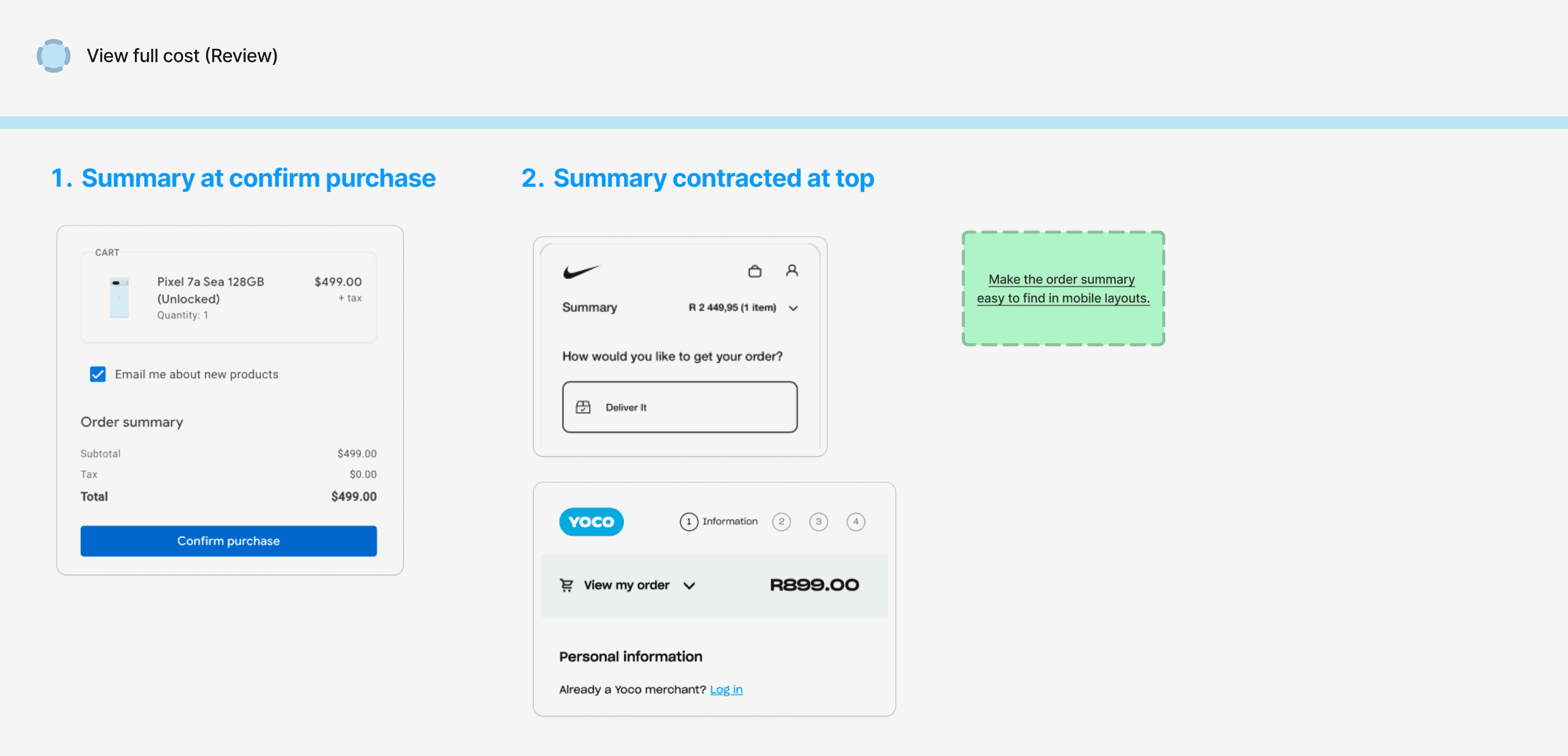
Users abandon cart because they cannot see the full cost until late in the journey.
Research — learn from the best, then localise
The pain points were clearly defined and based on user interviews, so there was high confidence that resolving them would meet the challenge. Competitor analysis plus desktop research became the methodology.
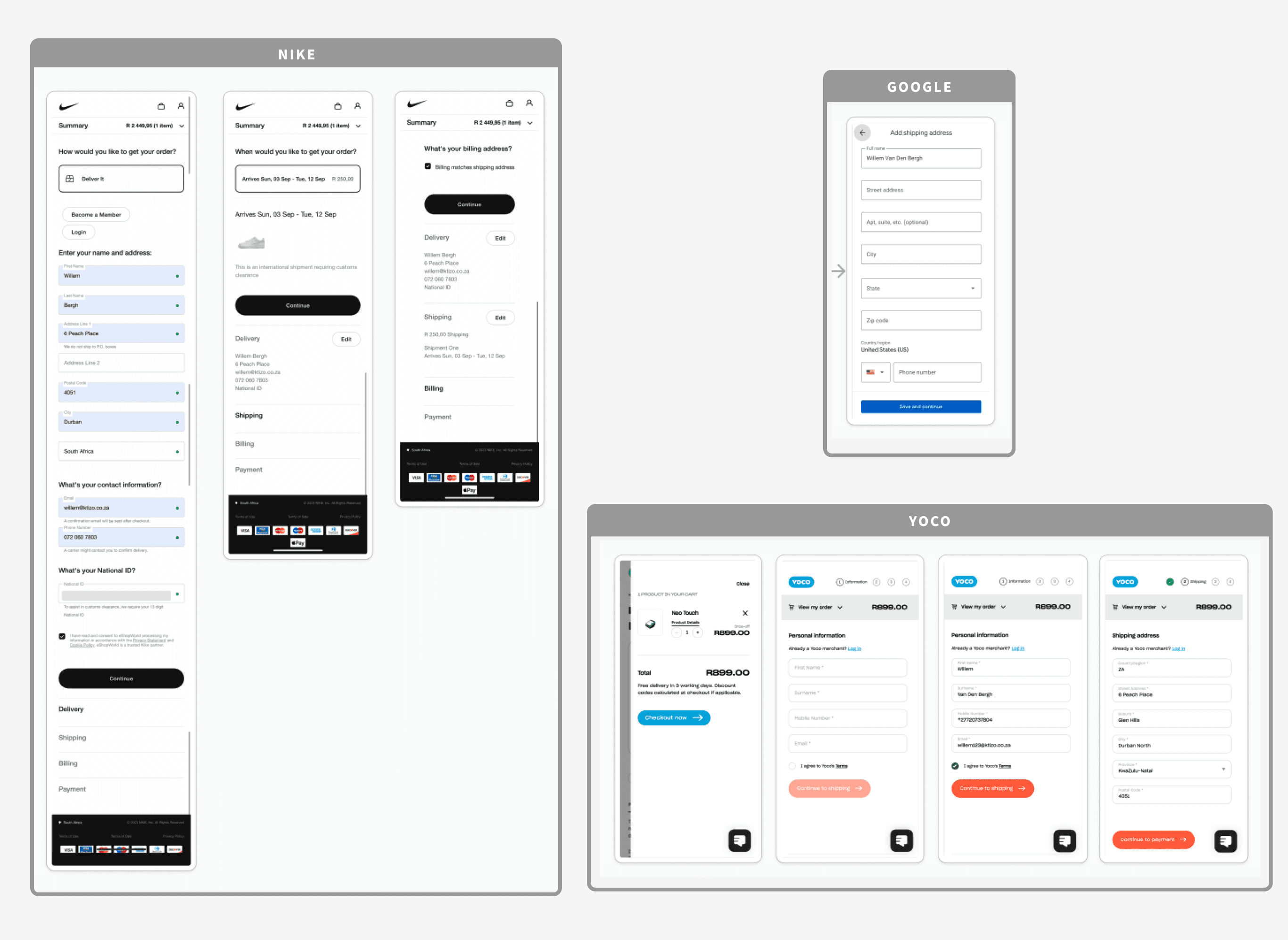
Nike and Google were selected as best-in-class purchase journeys — intuitive, mobile-friendly, with clear navigation. Yoco was the direct card-machine competitor in South Africa.
Insights — three solution concepts
Key ideas from competitors relating to the three primary pain points became solution concepts, informed by UX best-practice research on purchase journeys.
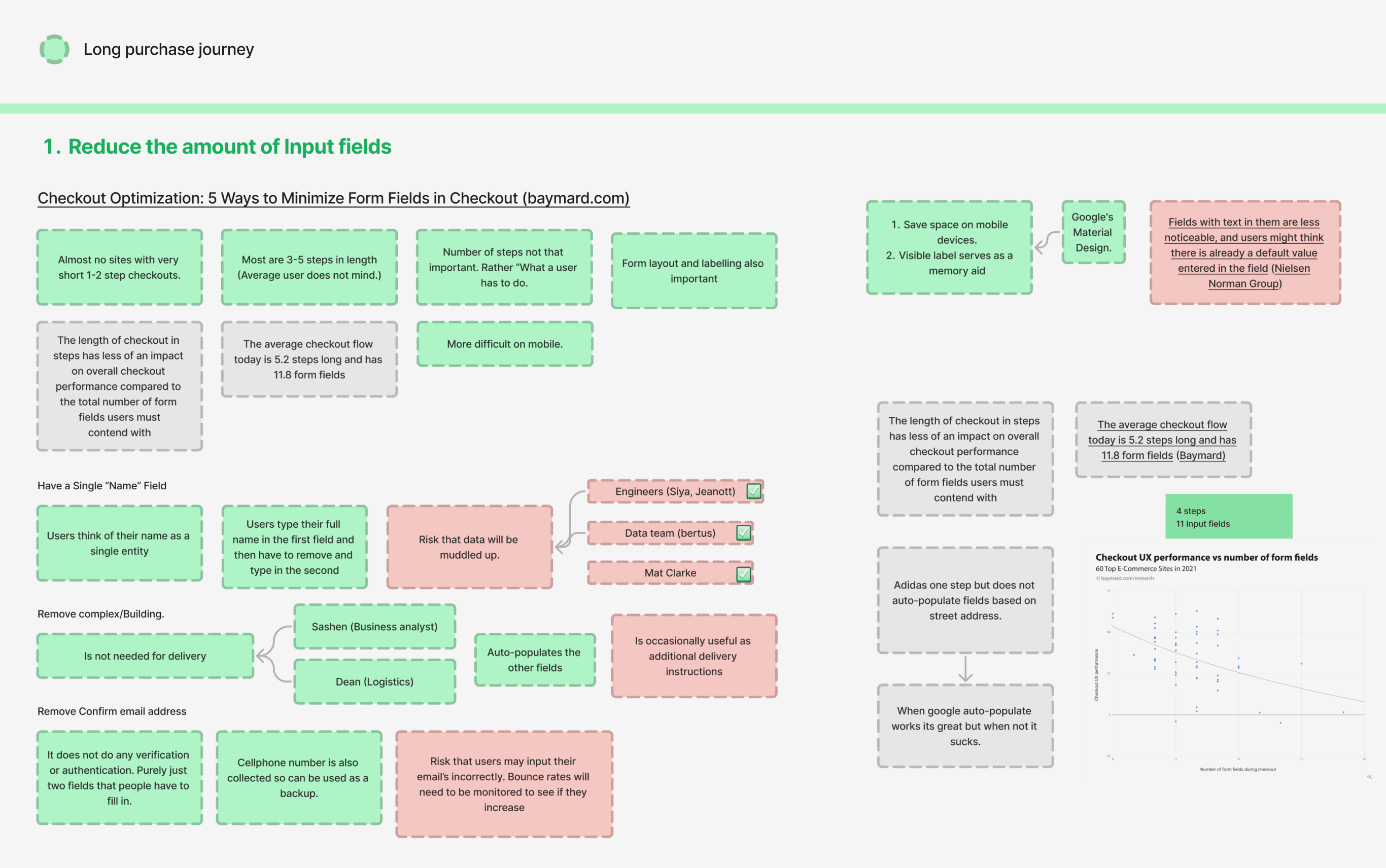
Reduce input fields
Step count alone does not shorten a journey — the amount of things a user needs to do does. Reducing input fields had a direct correlation to a shorter purchase journey.
Reinforce trust
A secure icon and wording such as “secure transaction” build assurance. Two of the three competitors already used these patterns.
Show the order summary
Competitors used a collapsible summary contracted by default. Simplifying the layout so full cost is visible at payment decreases drop-off.
Wireframe & iterate
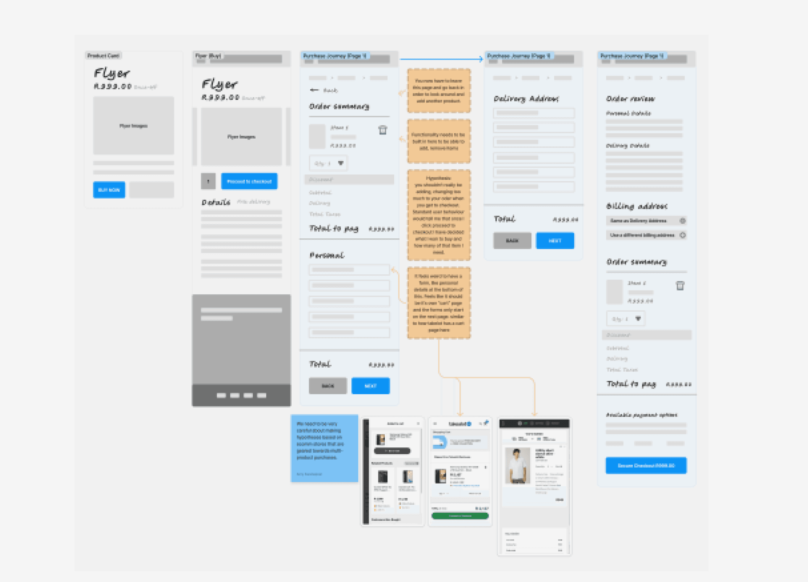
Several wireframe iterations were workshopped collaboratively. Solving the three user pain points informed every decision — cart, multi-step forms, and checkout review.
High fidelity — two options into testing
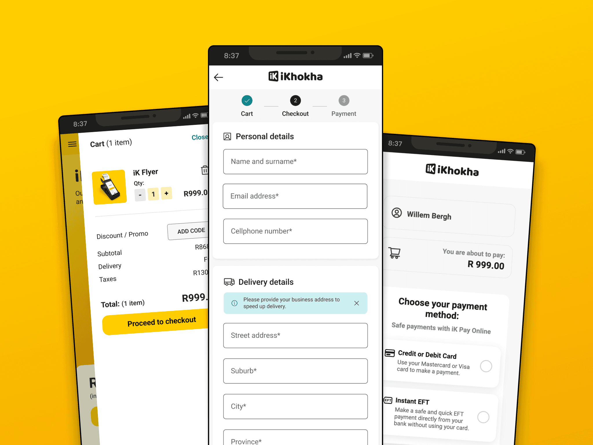
Two high-fidelity designs were prototyped. The first was a single-step option with reduced fields on one page (closer to Google). The second was a multi-step option (closer to Nike) that kept interactions in the same field of view with no scrolling.
A secure icon and “secure transaction” wording were added in both. The order summary sat on the add-to-cart modal and the final checkout so users saw full cost at the point of purchase.
Guerrilla test & shortlist
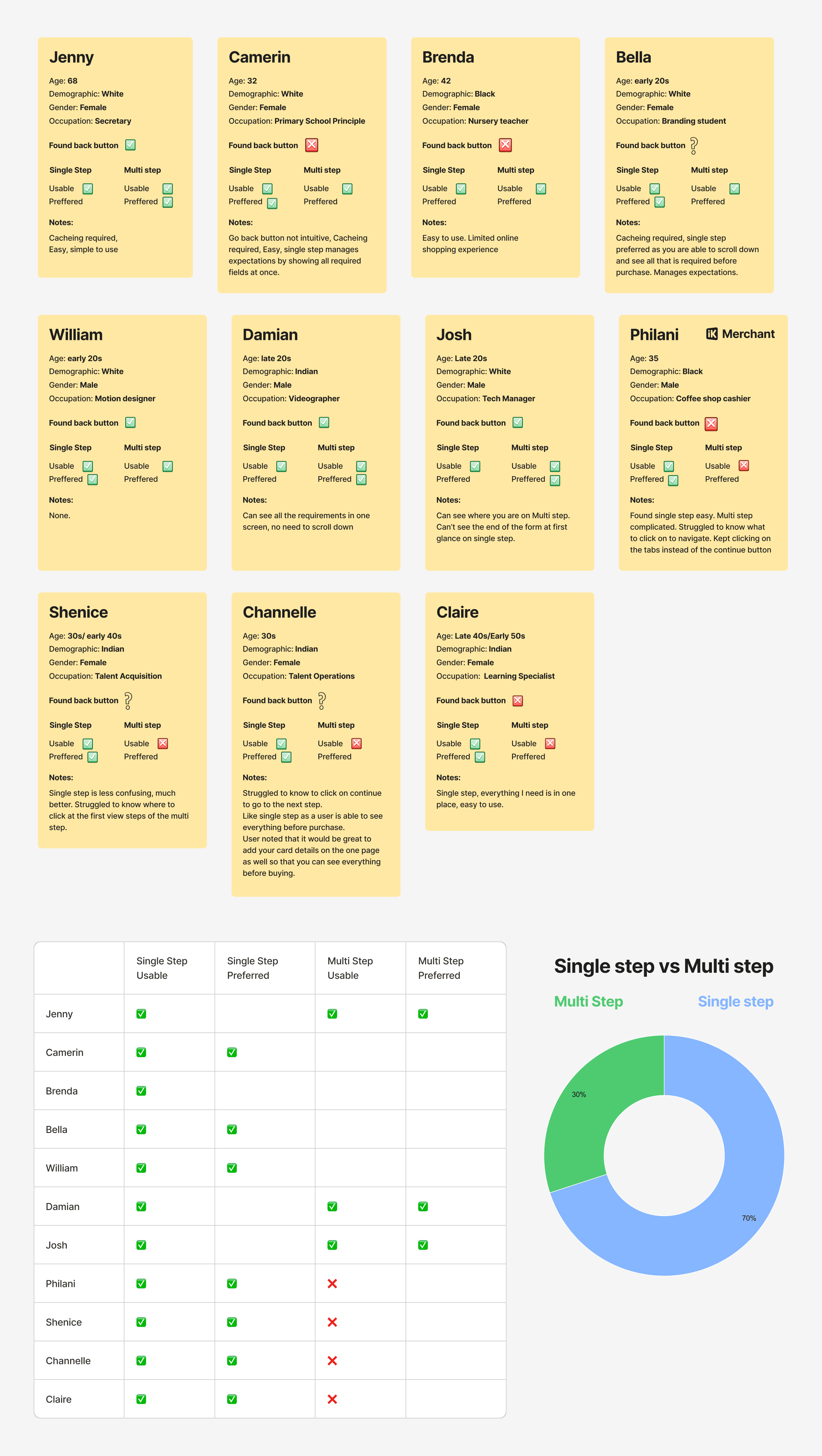
Eleven users — from school teachers and talent acquisition to video editors and tech — were asked to purchase an iK flyer on a mobile phone in person.
Seven of eleven found both options easy to navigate. Preference between single-step and multi-step was mostly split, but four users had significant difficulty with the multi-step option. We prioritised usability over preference and shortlisted the single-step journey.
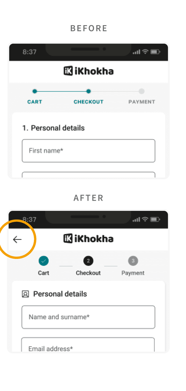
“Users did not understand that tapping the cart icon returned them to the previous page — a clear back button was added after the test.”
Outcome
Engineering built the new journey and we ran a HubSpot A/B test at a 50/50 split for about three weeks until statistical significance. The old journey was the control; the single-step redesign was the variant.
Completion rate uplift
Conversion rose from 3% to 6%. Time to convert fell from 9.3 to 6.9 minutes — a 26% faster checkout.